Working With DEMs
Now that we’ve learned a bit about what DEMs are and what they can be used for, let’s get some practice working with them in QGIS.
Quick file organization housekeeping:
Make a new folder inside your nr218 directory called lab_8. Inside that folder, make a data folder and a docs folder. All downloaded files will go in the data folder, and all generated outputs (more on this later) will go in docs. You should have a directory structure as shown below.
nr218/
└── lab_8
    ├── data
    ├── docs
Warm Up: Finding Data Online
So far in this class you’ve been given files to work with. Today, we’re going to practice acquiring some data on our own.
Generating DEMs, particularly at a high resolution, can be costly and time-consuming. Luckily, there are some great online resources for accessing existing imagery. One such resource is the USGS LiDAR Explorer.
Follow the link above, and then click “Launch Application” to get to the interactive map (Figure 1).
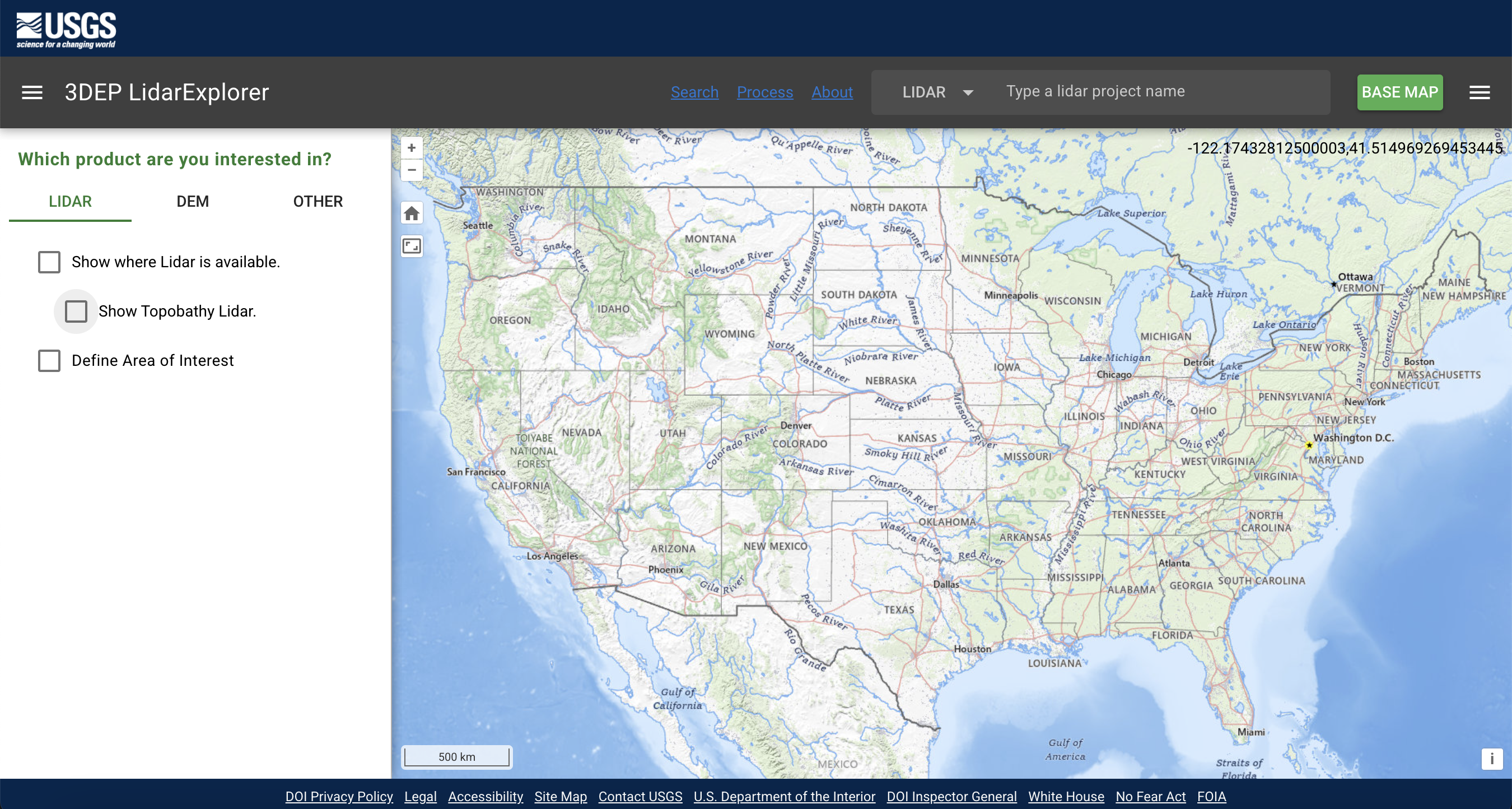
You can navigate around the map by clicking and dragging with your mouse. Zooming is accomplished using your scroll wheel (or the “+” button at the top left of the map viewer, if you like your zooming to be painful). Orient your map view so that it’s centered on San Luis Obispo. There are three check boxes in the left panel. Try checking and unchecking them to see what happens.
Next, let’s define our area of interest (AOI). This will return all of the available LiDAR and DEM downloads within a specified geographic area. Click the Define area of interest box and draw a box around SLO (by holding control and dragging), then check what pops up on the right side of the screen.
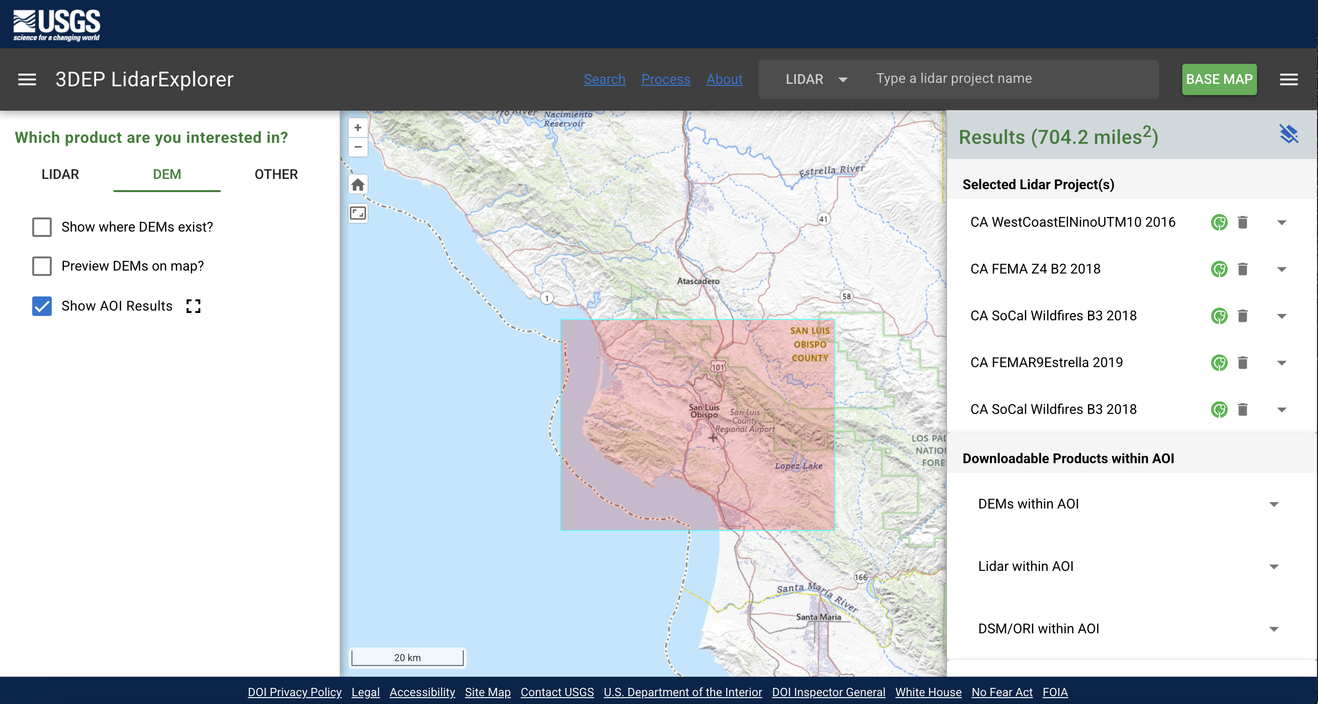
On the right panel, you should see dropdowns for DEM, LiDAR, and DSM/ORI products within the AOI. After we define the AOI, these dropdowns populate with all downloadable files in the area. In this case, we’re interested in what DEMs are available, so let’s expand that dropdown. As you can see, there are a lot of files! Too many! We don’t want to download that much data for this exercise, so let’s choose just one tile to download. First, click on the folder icon next to DEM 1 Meter. You should now see a list of individual files, like this:
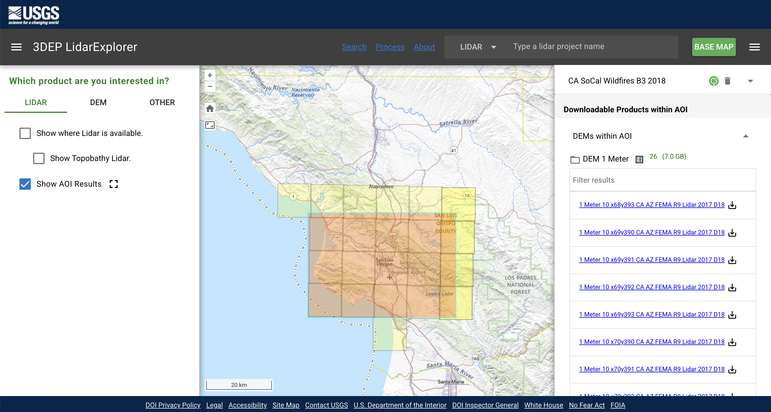
Choose one of the files on the list and click the download icon next to it. Once downloaded, rename the file to DEM_1_meter.tif and move it to nr218/lab_8/data.
Next, close the 1 meter file list (click again on the folder icon) and open the 30m folder. Choose one of those files to download, rename it to DEM_30_meter.tif, and save it to data.
Topobathymetric lidar measures land, water, and submerged land simultaneously. Topobathymetric lidar sensors use two independent laser sources. A near infrared laser is used to map the land and surface of the water, while a visible green laser is used to penetrate the water surface and measure the bottom (in water depths of up to about five meters, depending on water clarity).
If you wanted to use 1 meter DEMs for a project, but needed to cover a larger area, you could save on file size by downloading all of the individual tiles you needed and ‘stitching’ them together into a virtual raster (VRT) in QGIS. A VRT acts as a catalog for all selected raster files, rather than creating a new image. This can be useful for doing quick actions like reprojecting or clipping a large area of raster imagery, but you will get better overall performance using a merged TIF file.
Task 1: Comparing and Visualizing DEMs
- Open a new project in QGIS and save it to your
nr218/lab_8folder (NOT within one of the sub-folders). - Set the global CRS of the project to EPSG:26910 (UTM Zone 10N). You can do this by going to Project > Properties > CRS.
- Add in a satellite basemap of your choice.
- Add in your 1 meter DEM file. You have options on how to do this:
- Click and drag the file into QGIS from your file explorer
- Go to Layer > Add Layer > Add Raster Layer (You can also do this by hitting Shift + Ctrl/Cmd + R)
- Add in your 30 meter DEM in the same way.
Comparing DEM Resolutions
Take a look at the two DEM files. If they’re not both already in EPSG:26910, reproject using Raster > Projections > Warp (Reproject).
10 and 30 meter DEMs are typically much easier to track down than 1 meter. However, what we gain in accessibility and area coverage, we give up in detail and accuracy. To illustrate this, let’s compare the elevation values between the two DEMs.
Sampling Raster Values
We can do this using a tool called Sample Raster Values. First, we’ll need to add some points to our map.
- Go to Layer > Create Layer > New Temporary Scratch Layer
- Name the layer something useful, change the geometry type to to point, and make sure the CRS is 26910. Hit
Ok. - Editing should be toggled on by default, but if it’s not, click on the pencil icon. Then select
add point featureand add ~4 points to the map (click on the map to add a point). Make sure they are on areas of overlap between both DEMs, and try to cover different levels of elevation (lighter/darker gray).
- Once you’re satisfied with your points, hit the save icon (next to the pencil) and toggle editing off.
Now let’s check out the sample raster values tool using our 1 meter DEM.
- In the processing tools window, search for
sample raster values. - Select our newly created point layer as the input, and our DEM_1_meter as the raster layer.
- If you’d like, change the
output column prefixto something more informative. Then hitRun.
Examine the output of the tool. What did it do? Before we move on, rename the output layer (called Sampled by default) to something more useful.
Now run the same steps as above, but use the output layer as your input and the 30 meter DEM as your raster. You should now have a new point layer that includes the elevation attributes from both DEMs. Open the attribute table and look at the values - why do you think the values are different? Are there certain areas where they’re closer than other areas? Why might that be?
Take a screenshot of your final attribute table and add it to your submission doc.
Now let’s talk about visualizing elevation. By default, the numerical values of each pixel in a DEM are symbolized on a scale of black and white, also known as Singleband gray. In this state it’s pretty difficult to gain any information from the image, so let’s change it to something more useful.
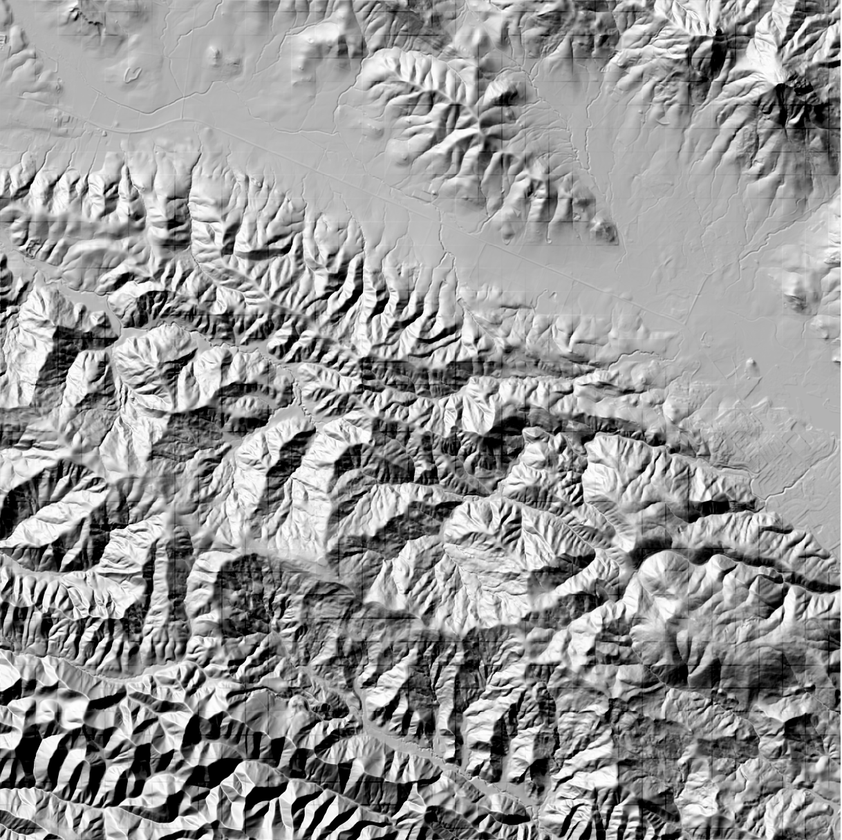
Hillshade
- Open up the Symbology window for the 1m DEM layer (can elaborate here if needed).
- Where it says
Render Type, click the dropdown and selectHillshade.
We can adjust the output of our hillshade by changing the values of the azimuth and Z factor. Take a moment to play around with the values for these parameters. What do you think each one does?
After you hit Apply, your DEM should look something like this:
Try the same process with your 30 meter DEM. How do the outputs differ?
Take a screenshot of your hillshade render and add it to your submission doc.
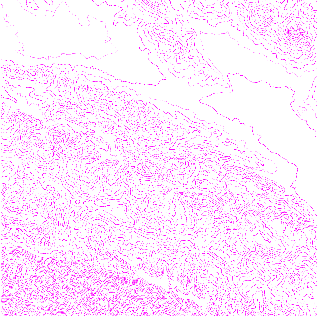
Contour Lines
- Go back to the Symbology window and change the Render Type to
Contour. Adjust theContour IntervalandIndex Contour Intervaluntil the amount of bands generated feels good to you (i.e. not too cluttered, but enough to actually show the topography). I would also recommend making the Index lines slightly thicker, for visual differentiation.
Now your DEM should look something like this:
We have another opportunity to compare our DEMs here. Change the symbology of your 30 meter DEM to contour lines, and look at the two layers together. Again, how do the two layers differ? What might be the cause of that?
Take a screenshot of your contour render and add it to your submission doc.
Task 2: Saving and Exporting DEM Visualizations
While these changes to symbology can be useful for quick visualizations of the landscape, if we were to send our DEM file to someone else, the adjustments wouldn’t be reflected on their end. Luckily, QGIS also has processing tools that we can use to turn our hillshade and contour lines into separate layers that can be shared.
Hillshade
- From the Raster menu, go to Analysis > Hillshade (or search Hillshade in the processing tools window).
- Adjust the Z factor if you’d like. Let’s keep the azimuth at its default for now.
- Click on the 3 dots to the right of the
[Save to temporary file]box and selectSave to file. Navigate to yourdatafolder and name the file something you can identify it by (i.e. include hillshade in the name). Before you hitSave, make sure the file format is.tif. - Leave all other parameters at their default and hit
Run.
Contour Lines
- Now go to Raster > Extraction > Contour (or search Contour in the processing tools window).
- Adjust the contour interval to the same value you used before (for this tool we don’t specify an index interval).
- Save the layer as a new file the same way you did above. Make sure that the file type is
.geojson. - Leave all other parameters at their default and hit
Run.
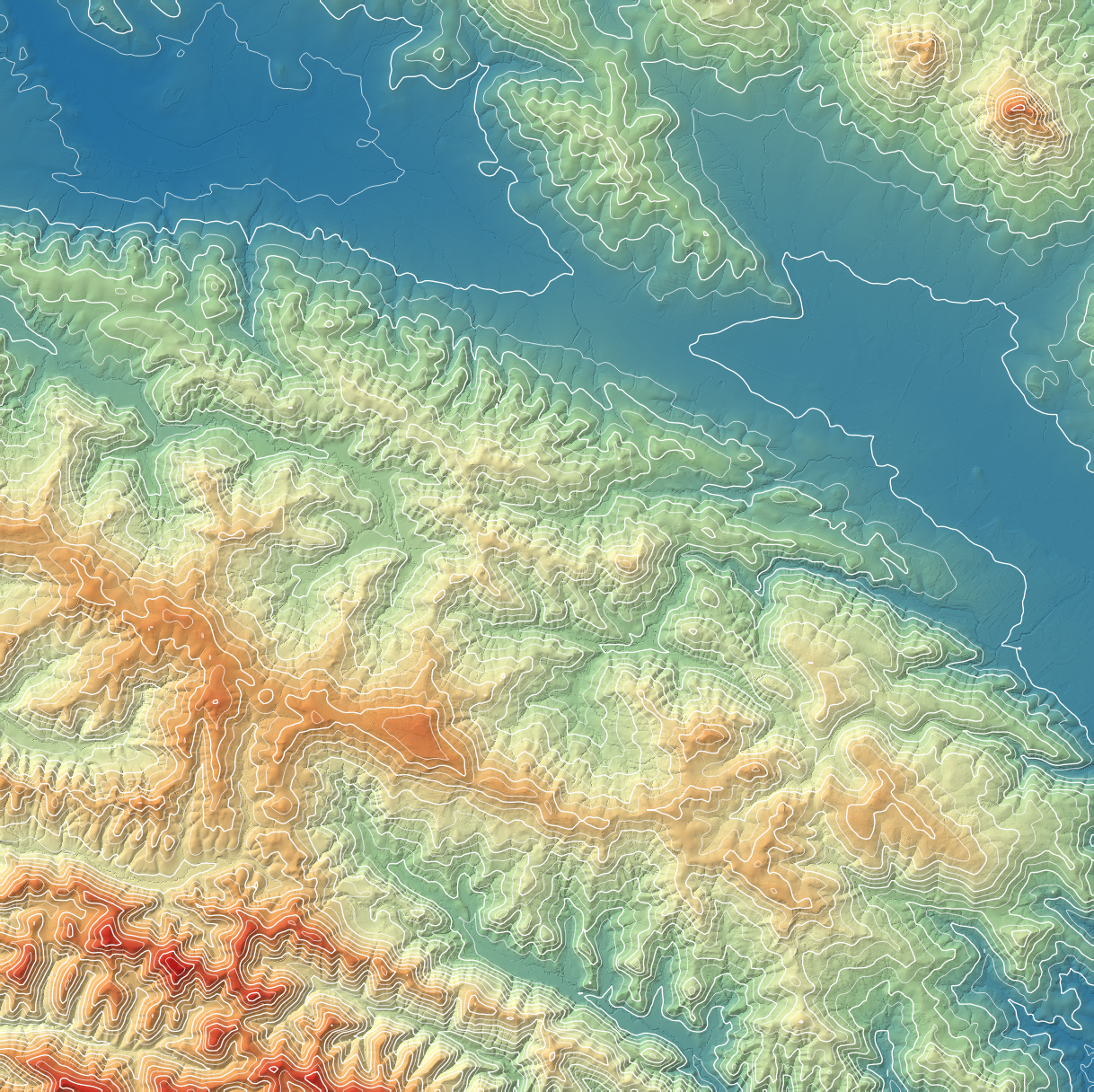
Combining DEM Visualizations
You should have two new layers on your map. We can now combine all of our DEM layers together to create an aesthetically pleasing map.
- Open up the Symbology window for our original DEM and change the Render Type to
Singleband pseudocolor. Choose any of the color ramps from the dropdown. - Make sure your hillshade layer is the second layer in the stack. In the Symbology window, change the
blending modetomultiply. Locate the Transparency tab (one below Symbology), and adjust the layer opacity to your liking. - Make sure your contour layer is the topmost layer. Go to the Symbology window and adjust the color and thickness of your lines to your liking.
Another Option: Red Relief
Alternatively, we can combine our DEM and hillshade layers to create the red relief visualization that we talked about in lecture.
- Change the render type of the original DEM back to
singleband gray. - Change the render type of the hillshade layer to
singleband pseudocolor. - Under the color ramp dropdown, choose
Create new color ramp. Set the first color to black, and choose a shade of red for the second. - Go back to the transparency tab and adjust the opacity to your liking.
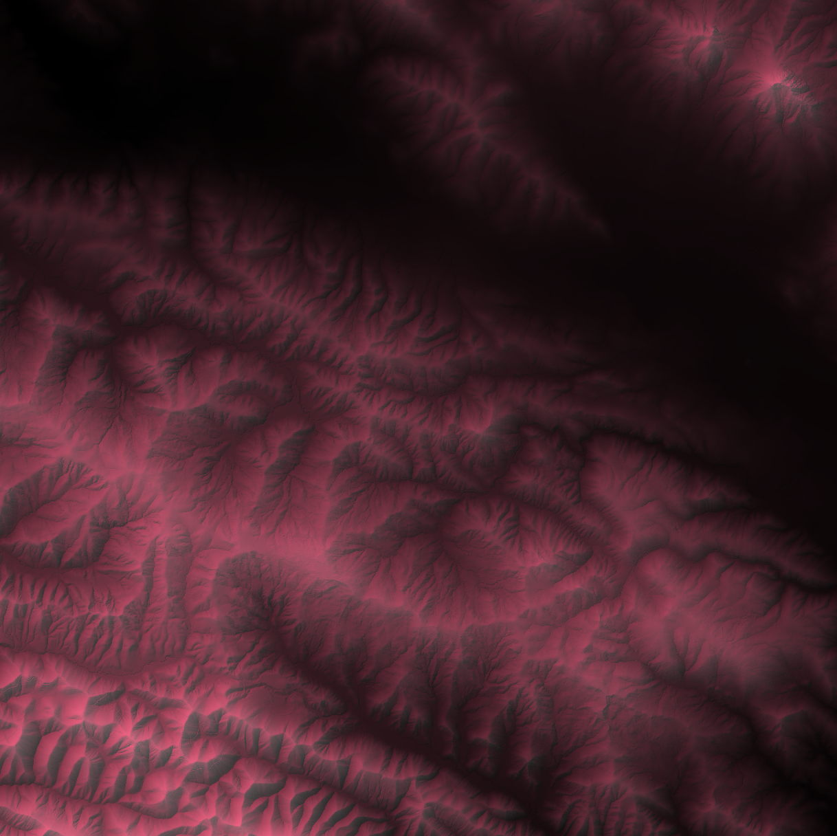
Nice! Something like this can be a great base for displaying other data layers (foreshadowing).
Task 3: Extracting Information from DEMs
There are many uses for DEMs beyond elevation, and many tools that we can use to extract additional information from them!
For the rest of this exercise, you’ll need to download this zip file(Open the link in a new tab and click “download raw file” button on upper right). Unzip the file and move the newly generated folder to data.
Add all of the files in the unzipped folder to your project in QGIS. You can remove the DEM layers used above .
Take a quick look through the layers from the folder. What types of data are we dealing with? Are they all in the same CRS? If not, we should take a moment to reproject.
Slope and Aspect
Slope tells us how steep the terrain is (in degrees or percent change from horizontal). Aspect tells us which compass direction each slope of the terrain faces.
We can generate layers for slope and aspect similarly to how we created our hillshade and contour layers. For slope, go to Raster > Analysis > Slope. Make sure your input layer is spr_DEM, and keep all other parameters at their default. Save the output to a file, like we did above, and hit Run. Do the same for aspect (Raster > Analysis > Aspect).
Examine the outputs of each analysis tool. What might you use a map of slope for? What about aspect?
Write down your thoughts and add screenshots of your slope and aspect layers to your submission doc.
Together with hillshade and contours, slope and aspect are often categorized as terrain analysis. We can generate other layers of information in a similar way, such as topographic position index (TPI), which classifies each pixel in relation to the altitude of its neighboring cells. Other terrain indices you might encounter include the topographic wetness index (TWI) and topographic ruggedness index (TRI).
Task 4: Putting It All Together
Oh no! Hydrologists at Swanton Pacific Ranch have lost track of all of their rain gauges! Luckily, we have the point layer open in QGIS right now. Since we have it open, they’ve asked for our help identifying one specific rain gauge. The rain gauge they’re looking for is:
- On a slope that’s facing Northwest
- Above 200 meters of elevation
- On a relatively flat area (less than 5 degrees of steepness)
Note! the pixel values for the Swanton Pacific Ranch DEM are in meters.
Using the layers that you’ve created, and the tools we’ve practiced with in this lab (OR tools that we’ve used in past labs… hint hint…), identify which rain gauge the team is looking for.
Once you have your answer, note which rain gauge the hydrologists are looking for, what the associated values are for slope, aspect, and elevation, and explain how you reached your conclusion on your submission doc.
Bonus: Exporting a Map
Great! Now that we’ve found the rain gauge, the hydrologists need a way to navigate to it. Let’s make them a couple maps to use as a reference. First, we’ll make a GeoPDF, or a georeferenced PDF.
Exporting a GeoPDF
Re-run the steps above to generate hillshade and contour layers for the SPR DEM. You can either do this using the Symbology tab, or generate two new layers. Once you have a map image that you’re satisfied with, go to Project > Import/Export > Export Map to PDF.
In the popup window, you can leave everything at its default, but make sure to check the box next to Create Geospatial PDF. Hit Save, and then navigate to your lab_8/docs folder and choose an appropriate name for the file.
Let’s take a look at what we just exported! Locate the file on your computer and open it in Adobe or a similar PDF viewer. Look for a Layers icon, and see what you can do - you should be able to toggle the map layers on and off. Pretty cool!
If you have the app Avenza on your phone, or something similar, you can import GeoPDFs from QGIS and use them as your base map! In this case, someone could in theory travel to Swanton and use the PDF we just exported to locate the missing rain gauge.
Exporting a Print Layout
It’s good practice for us to also export the map as a flattened PDF.
- Create a new map layout by clicking the
New Print Layouticon or hittingCtrl/Cmd + P. Name it something useful.
When setting up a map layout, we can make our lives easier by putting down guide lines for map items to automatically snap to. Let’s try it now - select the Guides tab on the right panel and add some horizontal and vertical lines. You can click on the side rulers, or manually type in the values that you’d like your lines to appear at.
- Now add a new map to the layout (Add Item > Add Map or click the Add Map Icon on the left side panel). Adjust the map to your liking by selecting
Move Item Contentsor hitting theCkey. You can also manually set the scale of the map in the Item Properties window. Do that now, and change it to a round number large enough to view the entire extent of the layers. - Next we’ll add a legend. Once you’ve created one, go to the Item Properties tab on the right and do some clean-up. Remember we can adjust which layers are included in our legend by un-checking
Auto-update, and then removing unwanted entries. We can also rename the entries we are keeping by double clicking on their names. - Next let’s add a scale bar. Play around with the number and width of each segments - you want to end up with a value that will be informative to your viewers. Place a second scale bar next to the first, and change the
StyletoNumeric. What does this number mean? Think back to step 1 - why is it helpful to set the scale to be a round number? - Lastly, add a map title.
- Click the
Export as PDFicon, or go to Layout > Export as PDF. - Save your pdf in your
lab_8/docsfolder, and name it something useful. - In this case, you can leave all of the parameters as-is and just hit save.
Use tree to show the directory structure for the project so far. Include it in your submission doc.
Upload your final map in addition to your submission doc.