import geopandas as gpdimport numpy as npfrom pathlib import Path# If you are following along change path change_this = Path('/home/michael/CP/UEFI/vectors')buildings_path = change_this /'eaton_buildings.geojson'aoi_path = change_this /'Eaton_Perimeter_20250121.geojson'DINS_path = change_this /'DINS_2025_Eaton_Public_View.geojson'# read buildings and aoibuildings = gpd.read_file(buildings_path)dins = gpd.read_file(DINS_path)aoi = gpd.read_file(aoi_path)print(f'buildings crs:{buildings.crs}')print(f'aoi crs:{aoi.crs}')print(f'dins crs:{dins.crs}')# join the dins attributes to buildingsjoined = gpd.sjoin( buildings, dins[['GLOBALID','DAMAGE','STRUCTURETYPE', 'geometry']], how='left', predicate='contains')joined.DAMAGE.value_counts()
buildings crs:EPSG:4326
aoi crs:EPSG:4326
dins crs:EPSG:4326
DAMAGE
Destroyed (>50%)    7131
No Damage           2299
Affected (1-9%)      549
Minor (10-25%)        89
Major (26-50%)        39
Inaccessible           6
Name: count, dtype: int64
OK, so now we see what the categories are, and how many buildings were damaged. We need to check for null values as well.
null_count = joined.DAMAGE.isnull().sum()print(f'Oh snap! there are {null_count} null values!')
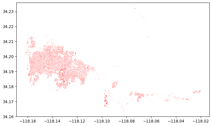
import contextily as cximport matplotlib.pyplot as pltbuildings.plot(color='red', figsize=(9, 9))
Not overwhelming. Some buildings, but it would be nice to have a base map, and a scalebar.
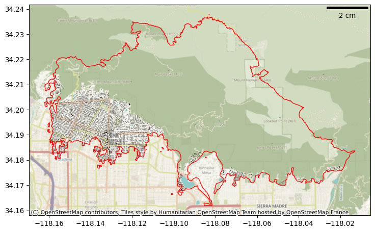
from matplotlib_scalebar.scalebar import ScaleBar# plot buildings in blackax = buildings.plot(color='k', figsize=(9, 9))# plot fire perimeter in redaoi.plot(edgecolor='red', facecolor='none', ax=ax)# add basemapcx.add_basemap(ax, crs=buildings.crs)# add scalebarscalebar = ScaleBar( dx=1, units='m', location='upper right', color='black', box_alpha=0.0, rotation='horizontal-only');ax.add_artist(scalebar);
Note that because this is in 4326 the scalebar is really only aurate in the x direction. So this gives us a basemap, and a scalebar. If we want an interactive map we can use Folium.
Make this Notebook Trusted to load map: File -> Trust Notebook
Vectors are represented as geoJSONs in Folium, so we cant just use the GeoPandas plot function. We have to iterate through, create geoJSON representations of each polygon and add them to the map.
from folium.plugins import TagFilterButton# make a color mapping dictionarycolor_map = {-99: 'black',0: 'blue',1: 'lightpink',2: '#ff9a9a',3: '#ff5555',4: 'red'}def style_fn(feature): code = feature['properties']['damage_code']return {'fillColor': color_map.get(code, 'gray'),'color': 'black','weight': 1,'fillOpacity': 0.7, }# create a layer for buildings in each damage categoryfor dmg in joined.DAMAGE.unique(): folium.GeoJson( joined[joined.DAMAGE == dmg].__geo_interface__, style_function=style_fn, tooltip=folium.GeoJsonTooltip(fields=['DAMAGE'], aliases=['Damage:']), tags=joined[joined.DAMAGE == dmg]['DAMAGE'].to_list(), name=f'Buildings: {dmg}' ).add_to(map)# make popup to display structure typepopup = folium.GeoJsonPopup( fields=['STRUCTURETYPE'], localize=True, labels=True, style="background-color: white;")# add a layer view controlfolium.LayerControl().add_to(map)# comment / uncomment to run in local notebookmap.save('docs/big-ol-map.html')#map
Not that we did not directly render the map, but saved it to an image. If you look at the qmd file you will see that the saved image was then inserted using
This is done because Quarto cannot directly insert more than 5000 polygons in a Folium map when rendering html documents. So instead we save the folium map and add it in an iframe.
Also note the use of the GeoDataFrame.__geo_interface__ This returns a GeoInterface standard representation (which is a json).